Your submission form may be the initial contact someone has with your organization. If your form isn’t accessible, you could be blocking contact from highly qualified applicants. How can you remove this roadblock that stands in the way of those who might not receive and submit information in traditional methods?
Why are accessible submission forms needed?
Web forms can be difficult even when specially designed to reduce or eliminate barriers. The world is full of forms that are non-intuitive, difficult to understand, that time out in the middle of completion, or that don’t clearly define what is required or in what format. If you’re someone living with a disability, an unthoughtful submission form can become an insurmountable obstacle.
Without accessibility, web forms can bar applicants who need accommodation from submitting. To ensure your submission process is open to all, your organization should consider every step of the form’s construction to ensure anyone can easily use it.
Accessibility vs. usability
When it comes to web design, usability is essential. The user experience (UX) will depend on how well thought out, logical, and intuitive a website or a webform is. However, usability often expects that the user will be operating in a specific way, and can ignore barriers that keep differently-abled persons from accessing the platform at all. Without accessibility, usability is… useless.
Accessibility depends on taking the usability of the webform and expanding it so it encompasses those who may have a visual challenge or cannot use a typical keyboard. When a platform is both accessible and usable, it allows higher participation from overlooked demographics.
People who can benefit from accessible forms
Accessible forms should be easier for everyone to use, not just those with disabilities. However, there are specific areas that can aid clearly identified segments of the population:
Those with cognitive challenges
Layout structure, instructions, and feedback options can provide better understanding and ability to complete submission forms for those with cognitive disabilities.
Those who need to use speech controls and speech to text software
Labels and controls that are voice command friendly can help users shift from field to field easily, identifying and accurately inputting the correct information in all required fields using speech input.
Those who have limited motor control
Large clickable areas and big fonts with clear labels can make forms more comfortable to navigate for users with limited dexterity who can find it difficult to point and click a mouse at a tiny spot on the screen
Those who need the assistance of screen readers
Correctly, fully labeled forms containing all necessary information are easier to identify and understand for users who have visual impairments.
Those who navigate solely using keyboard controls
Forms that can be completed using a keyboard alone, without the need for a mouse make submission forms accessible for those who rely solely on keyboard controls. This can mean the necessity to avoid JavaScript, which can render a form inaccessible to keyboard-only users.
Testing your current forms for each of these accessibility issues can highlight where you need to improve. If you’re only now setting up submission forms, choose a platform that is designed to create forms that meet all of these accessibility requirements.
Steps to accessible submissions forms
Ensuring accessibility should be a multistep process, with testing at every point. Following this guide can help you create forms that are accessible and usable by almost anyone.
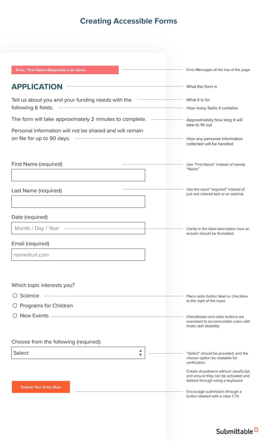
Introduce your form
Start with a text-based introduction capable of being read visually or with the aid of a screen reader. This part of your form should clearly explain:
- What the form is
- What it is for
- How many fields it contains
- Approximately how long it will take to fill out
- How any personal information collected will be handled
Layout your form
The most accessible forms run straight down the page, one question and answer field after another in a vertical progression. While it can be tempting to try and cut down on scrolling and use the empty space, forms that have both horizontal and vertical orientation are hard to navigate for the visually impaired and tables can confuse screen readers.
Stick with best practices for Human-Computer-Interaction (HCI) when it comes to address fields—city, state, zip-code is the best format and can avoid accidental entering of the city name in a zip-code field that appears higher than usual. First-name, last-name, order is also standard rather than the reverse.
Simplify navigation
Your form may require multiple pages. Introduce each page with text (“This is page two of four”) and offer clear, full-sentence options (“Go back to the previous page” or “Go to the next page.”) You can include navigation at the top of each page to allow visually challenged users to jump to specific fields.
Group related fields
Make your submission forms logical by creating sections for related fields. Again, make sure you introduce each section for enhanced clarity. For example:
“This section is for your contact information. You’ll need to input your first name, last name, pen name, date of birth using two numbers for the month, two numbers for the day, and four numbers for the year, and your current mailing address.”
Label fields clearly
Place each label for a text field immediately preceding the field it’s associated with (above or directly to the left) and allow blank space between fields to make it impossible to confuse which label goes with which field. Make labels clear and comprehensive by providing as much information as possible:
- Use “First Name” instead of merely “Name”
- Use the word “required” instead of just red-colored text or an asterisk
- Clarify in the label description how an answer should be formatted (such as dates)
Optimize selection fields
Place radio button label or checkbox to the right of the input. Put labels for dropdown boxes above or to the left as with text fields.
Checkboxes and radio buttons should be oversized to accommodate users with motor skill disability. When selected, visually challenged users should be able to verify their selection by reading back the selected option using their screen reader.
Create dropdowns without JavaScript, and ensure they can be activated and tabbed through using a keyboard without accidentally selecting the top option. A separate mechanism such as a button labeled “Select” should be provided, and the chosen option be readable for verification. If the applicant can begin typing in a drop down list to narrow the selections, let them know in the instructions.
Use headers
Headers (H1, H2, H3, etc.) should be used to provide instructions throughout the form, and should be used in descending order.
Error flags
An error message compatible with screen readers should be triggered automatically if a user completes a field incorrectly. The error should appear at the top of the page and allow the user to access the (cleared) field in question immediately. Provide information about the error, and offer an easily actionable solution.
Offer review options
As users complete each page, allow them to review their input information. You can accomplish this by interspersing screens that will enable a review of input data in large text that is also screen reader-friendly. Each piece of data should be preceded by the field label, to help users catch if they entered the wrong data in a field (such as reversing name order).
Offer attachment options
Attachment options should be accessible via a large button that states clearly what it is for and lists acceptable file types. Avoid language like “click here” and instead use specific, detailed call to action language such as “Upload your submission as a word document.”
Add progress markers
Inform users of their progress by announcing their advancement at the top of each new screen. For example, “This is step four out of six steps” at the top and “You have completed step four” and at the bottom.
Enable auto save
The system you use should consider any extra time it may take for persons using assistive or adaptive tools to complete the form, ensuring changes to a form are auto-saved. If the auto save message is not readable by a screen reader, be sure to let applicants know about the auto save in the form instructions.
Allow forms to be revisited and completed
Allowing users to save their progress and return to the application at a later time or later date gives people the opportunity to take as much time as they need with a form, since using adaptive tools can take time and energy. Allowing users to return to their form after it’s submitted to add further information or updates also gives everyone a better chance to apply with ease, so that their work is considered instead of their ability to quickly submit it.
A clear call to action (CTA)
When the user has completed all required steps, encourage submission through a button labeled with a clear call to action, such as “Submit your entry now.”
Testing your submission form
Every page and field of your submission form should be tested using available assistive and adaptive technologies, ideally by persons with various disabilities and challenges. Ideally, the platform you use to create your forms will follow best practices for accessibility as well as usability, making your forms easy to complete and submit––along with any required attachments.
These resources can be invaluable as you explore how to make your forms more accessible and inclusive:
- The Web Accessibility Initiative
- The Internet Society Accessibility Whitepaper
- WebAIM – People with Disabilities on the Web
With Submittable, you can create clear, intuitive, accessible forms that deliver a high-quality user experience while providing plenty of submissions that meet your brief and requirements. Learn more about creating accessible submissions forms today at Submittable.com.

Freedom Ahn, MBA, is an expert business and technology writer; a self-professed supply-chain geek; and an award-winning short-fiction author and playwright. She is also a freelance American-Japanese translation/transcreation consultant.