Fix The Form is a movement focused on reducing the burden on grant seekers and improving equity in the granting lifecycle.
#FixTheForm is spearheaded by Kari Aanestad, Co-Director of GrantAdvisor.org and Director of Advancement at the Minnesota Council of Nonprofits, and Laura Solomons, Head of Donor Relations for the Sutton Trust and incoming Chair of the Peter Minet Trust. In late 2020, they launched a survey seeking to identify the top applicant pain points, ranked by the impact they have on nonprofits. After all, every extra minute spent navigating grant applications is a minute not spent on important mission-driven work.
Making the application process pain-free and user-friendly will lower the barriers for the organizations that need your support the most.
#FixTheForm survey respondent
Over 500 grantseekers, spanning nine countries and every area of the nonprofit sector, responded. The movement is now a call to action for grantmakers everywhere: are you creating unnecessary burdens for applicants? The findings can be used as a checklist for conscientious funders as they evaluate grant management software. (Fix The Form created a checklist for your team too—find it here, made available by the Peter Minet Trust.)
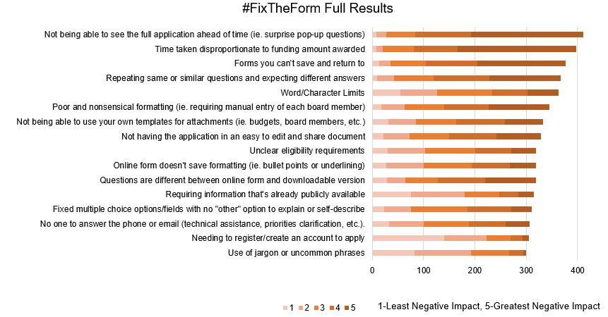
Here, we’ll break down #FixTheForm’s survey results, in order of the top offenders, and guide you through how to create better, more thoughtful, and more equitable grant applications (and how Submittable can help).

#FixTheForm pain points
- Not being able to see the full application ahead of time (i.e., surprise pop-up questions)
- Time taken disproportionate to funding amount awarded
- Forms you can’t save and return to
- Repeating same or similar questions and expecting different answers
- Word/Character Limits
- Poor and nonsensical formatting (e.g., requiring manual entry of each board member)
- Not being able to use your own templates for attachments (e.g., budgets, board members, etc.)
- Not having the application in an easy to edit and share document
- Unclear eligibility requirements
- Online form doesn’t save formatting (.g., bullets and numbering)
- Questions are different between online form and downloadable version
- Requiring information that’s already publicly available
- Fixed multiple choice options/fields with no “other” option to explain or self-describe
- No one to answer the phone or email (technical assistance, priorities clarification, etc.)
- Needing to register/create an account to apply
- Use of jargon or uncommon phrases
Pain point #1: Not being able to see the full application ahead of time (i.e., surprise pop-up questions)
The number one pain point identified in the survey both received the most votes and was rated the highest in terms of negative impact. The consensus is clear: grant seekers want access to the full application ahead of time, such as in a downloadable version of the form. This allows them to prepare fully, gather needed resources, and manage their time efficiently. Without access to the application ahead of time, unexpected questions can create a serious log jam, taking extra time and causing unnecessary stress.
It’s important that your software can make your full application visible to applicants in a downloadable version—including questions that may or may not be relevant based on conditional logic. Extra bonus if the downloadable version is available to applicants who are not logged in or before they have created an account.
More Fix The Form, Live
In this webinar, Submittable will facilitate a conversation and live form assessment with Kari Aanestad, Co-Director of GrantAdvisor.com and co-founder of #FixTheForm
Pain point #2: Time taken disproportionate to funding amount awarded
This is a meaty one. An evolved generation of funders take care to follow trust-based principles, focusing on building meaningful relationships with grantees as opposed to the transactional, compliance-obsessed approach of the past. The central tenet as relates to this pain point is to only ask questions on a need-to-know basis.
Several of the principles of trust-based philanthropy provide guidance to help you keep questions that qualify as “need to know” limited in number, including:
- Multi-year, unrestricted funding: Eliminating questions regarding program-specific work as well as the need to reapply year after year
- Do the homework: Putting the onus on grantmakers to put in more of the work in the vetting process
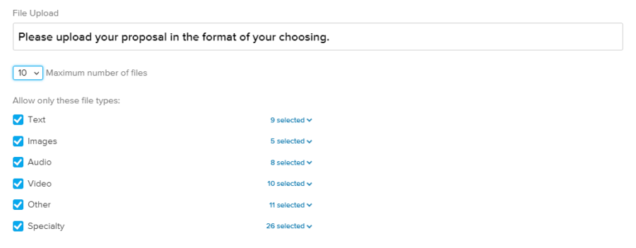
- Simplified and streamlined paperwork: Accepting proposals in diverse media formats (e.g., video or audio) and those prepared for other funders, as well as employing a screening process
To address this pain point, look for a grant management solution that leverages integrations to reduce the need to ask certain questions, such as data that can be provided by Guidestar. You’ll further want technology that allows for internal forms, accepts diverse file uploads, includes form logic, and screens for eligibility.
Pain point #3: Forms you can’t save and return to
Anyone who’s ever had their computer crash knows how frustrating it is to lose their work. A grantmaking platform that saves drafts for applicants to return to gives them necessary flexibility. It also protects them from unforeseen interruptions, such as being suddenly called away for an urgent meeting—and auto-save will provide further protection from a sudden internet outage.
Pain point #4: Repeating same or similar questions and expecting different answers
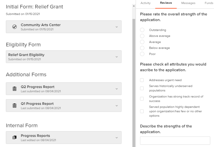
Asking your grantee the same question isn’t just a time waster, it’s disrespectful—it shows them that you didn’t listen the first time. A grant management software that automatically organizes all of your various forms (i.e., the LOI, eligibility forms, internal forms, application forms, reference forms, and follow-up forms) in the same place allows your whole team to ask each question only once, knowing you can easily find and access that information throughout the grant lifecycle.
Pain point #5: Word/Character Limits
Many funders may believe that imposing word and character limits helps prevent applicants from investing too much time on a written response question. However, in reality, it often results in more time wasted right-sizing written responses for every single funder. This word-smithing—replacing “and” with “&” and other tedious space-saving techniques—is frustrating and unnecessary. A better way? Allow your applicants to submit responses to common questions, such as around program objectives or measurement, in whatever format and length they already have it (such as something prepared for another funder).
In cases where you must impose a word or character limit, at the very least, ensure you use a software that exposes the limit and the current count to applicants.

Pain point #6: Poor and nonsensical formatting (e.g., requiring manual entry of each board member)
When creating your form, apply common sense, and don’t skip a careful proofread. Your platform should have a preview tool that makes it easy for you—as you build it—to experience your form as an applicant would and make adjustments when necessary. Preview can also help you double check that your conditional logic is working as intended, that your instructions are clear, and that all required questions have been marked as such. It can help provide extra peace of mind if the preview tool is available before you launch your program.
I have literally lost hundreds of hours to troubleshooting and navigating poorly designed grant applications and portals.
#FixTheForm survey respondent
A grantmaking solution that includes many question types that can clarify precisely the information requested can also help—for example, a date field, URL, or number field that allows you to set parameters or apply a format, such as currency.
Expert Guidance to Help Your Applicants Thrive
At Submittable, we’re just as committed to helping your applicants be successful as you are.
Pain point #7: Not being able to use your own templates for attachments (e.g., budgets, board members, etc.)
Your grant seekers almost definitely have all of the information that you need from them. So why require them to recreate the wheel? Addressing this pain point requires a two-pronged approach:
- First, you must adopt an ideological openness that your templates are not the only, or necessarily the best, options. This includes accepting that allowing for grantee templates will result in some variation among applicants.
- Second, you’ll need a granting technology that accepts many media file types, as each organization uses those that are best for them. Be sure to look for one that not only accepts the files, but makes them viewable by your reviewers without having to download them—otherwise, you risk setting your review team up for a frustrating experience.
Pain point #8: Not having the application in an easy to edit and share document
Editability and shareability are both important ways you can empower applicants to put their best foot forward. Each can be addressed by the right solution:
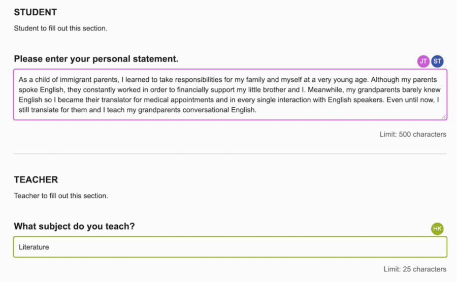
- Choose a platform that allows applicants to make edits when necessary. Ideally, applications should lock by default, but your team should be able to open them for editing upon request. This will help both facilitate transparency and avoid confusion throughout the process.
- Find a granting technology that allows for applicant collaboration. Given the wide adoption of remote work, if the collaboration can happen in real time, including field presence, all the better.
Pain point #9: Unclear eligibility requirements
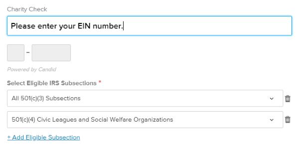
Making sure that your guidelines outline your eligibility criteria is a must. Take it a step further by choosing a grant management software that includes eligibility screening through an upfront quiz.
This ensures that ineligible applicants waste minimal time on your opportunity. The right solution will then give you a chance to point them toward other resources or programs for which they may be eligible. It’s also key that the information you gather in the eligibility form be stored with the full application, so that you don’t need to ask the same questions twice.
Pain point #10: Online form doesn’t save formatting (e.g., bullets and numbering)
Rich text formatting makes it so much easier to communicate a message and be understood. That’s why a platform that allows for rich text formatting in your long answer written response questions is such a winner with applicants (not to mention your review team).
Look for one that has an easy-to-use “WYSIWYG” (what you see is what you get) style text editor for maximum user-friendliness.

Pain point #11: Questions are different between online form and downloadable version
This one is on your team—make sure that as you edit your form, you update your downloadable version. Again, it’s also important to make sure that you include any questions behind conditional logic in the downloadable version (see pain point #1 above).
Making the application process pain-free and user-friendly will lower the barriers for the organizations that need your support the most.
#FixTheForm survey respondent
Pain point #12: Requiring information that’s already publicly available
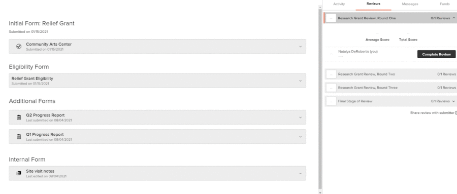
Back to the principles of trust-based philanthropy, it’s important to do your homework. This means that your team plays an active role in the vetting process and doing the research that is available to you: for example, if full board bios and photos are available online—which they typically are—there should be no need to ask for them in your form.
Where your technology can help is when it comes to making all of the data, including data sourced by your team, available to your review team. Look for a platform that includes internal forms, which you can design according to your needs in order to input and store data from your team within the reviewer portal. Bonus if the internal forms feature allows for file uploads, so that your team can upload conversations with grant seekers and other media.
Pain point #13: Fixed multiple choice options/fields with no “other” option to explain or self-describe
This one requires humility. To address this pain point, you first need to embrace the fact that you won’t always know the correct options for every grantee. Including an “other” or “prefer to self describe” option not only helps applicants feel included, it also ensures that the data you collect is accurate—just think, if none of the options applied to an applicant, but the question was required, they would be forced to select an inaccurate response (or forego the opportunity).
The use of conditional formatting helps to create a streamlined applicant experience, where only those who choose to self-describe will be prompted to do so.
Pain point #14: No one to answer the phone or email (technical assistance, priorities clarification, etc.)
Not providing appropriate support to grant seekers during the application process is setting the stage for a rotten relationship. There are two varieties of assistance you should be prepared to provide:
- Substantive assistance: Questions may come up about the kind of information you are asking for, eligibility, or others related to the application itself. You need to not only have a dedicated team member ready and willing to answer these questions, you also need to provide their contact information in your guidelines. (Pro tip: As questions come up, edit and improve your form and guidelines to create a better experience for applicants and reduce the burden on your team!)
- Technical assistance: Even with an intuitive platform, technical questions inevitably pop up. You can ease this friction by choosing a solution with a robust help center that includes video tutorials, as well as human support for your applicants. Beware of solutions that will only help your team, and leave it to you to help your applicants with technical questions.
Pain point #15: Needing to register/create an account to apply
This pain point is a bit of a mixed bag. As addressed earlier (and therefore of higher priority), grant seekers desire several features that are best made available through the existence of some kind of account. These include:
- The ability to save and return to a draft
- The ability to edit applications
- The ability to collaborate with others
Additional functionality that requires an account includes in-app messaging, which facilitates transparency and relationship building. What to do then, if the very need to register is considered a hurdle?
The key here is to find a grant management software that makes the “create an account” step as quick and painless as possible. This means requiring only bare minimum information: generally, a name, an email, and a password. Even better is allowing for sign-in with a major platform that many grant seekers will already have a profile with, such as Google.
These changes will really help us be able to spend less time and money on form filling and more on the causes and people we support.
#FixTheForm survey respondent
Beware of systems that require applicants to create a full profile before moving forward—or that claim no registration is needed, but fail to offer the other, more important features identified above.
It’s also helpful if, referring back to pain point #1, you can make your downloadable version available to applicants before they need to create an account, so that they only have to go through the registration step when they are ready and sure that they’ll apply.
Pain point #16: Use of jargon or uncommon phrases
Only you can ensure that your application uses accessible language. (But Submittable’s Ultimate Guide to Creating Accessible Submission Forms can help.)
Learn more about Submittable
At Submittable, we’re just as committed to helping your applicants be successful as you are. And our implementation team members are experts at helping you create a form that captures everything you need to know, without introducing unnecessary burden for applicants. Get in touch with us for a free demo to learn more.
Learn more about Fix The Form
Kari Aanestad and Laura Solomons have continued to build off the #FixTheForm movement’s momentum: GrantAdvisor.org and the Technology Association of Grantmakers (TAG) partnered to launch “100 Forms in a 100 Days”. The campaign successfully urged over 100 foundations to make their grant applications publicly available within 100 days. Learn more on the GrantAdvisor blog.