No matter your industry, a strong website is one of the most important tools for professional success. Although you want to quickly get the word out about your organization online, you also don’t want a poorly constructed website that sends the wrong message about your organization. For organizations hosting a submission call, a website is especially important to get the word out and provide a reliable source of information for submitters. Here are 7 tips to help you get started optimizing your website to promote your submission call.
Make Your Mission Obvious and Navigation Intuitive
Think of your website as a first impression for your organization. When a user first arrives on your web page, the mission should be immediately apparent. For example, if you’re an arts organization, include imagery and text that emphasize your commitment to the arts. The goal is not to overwhelm users with content, but to give them a strong, accurate idea of who you are and what you do for those who may be discovering your organization for the first time.
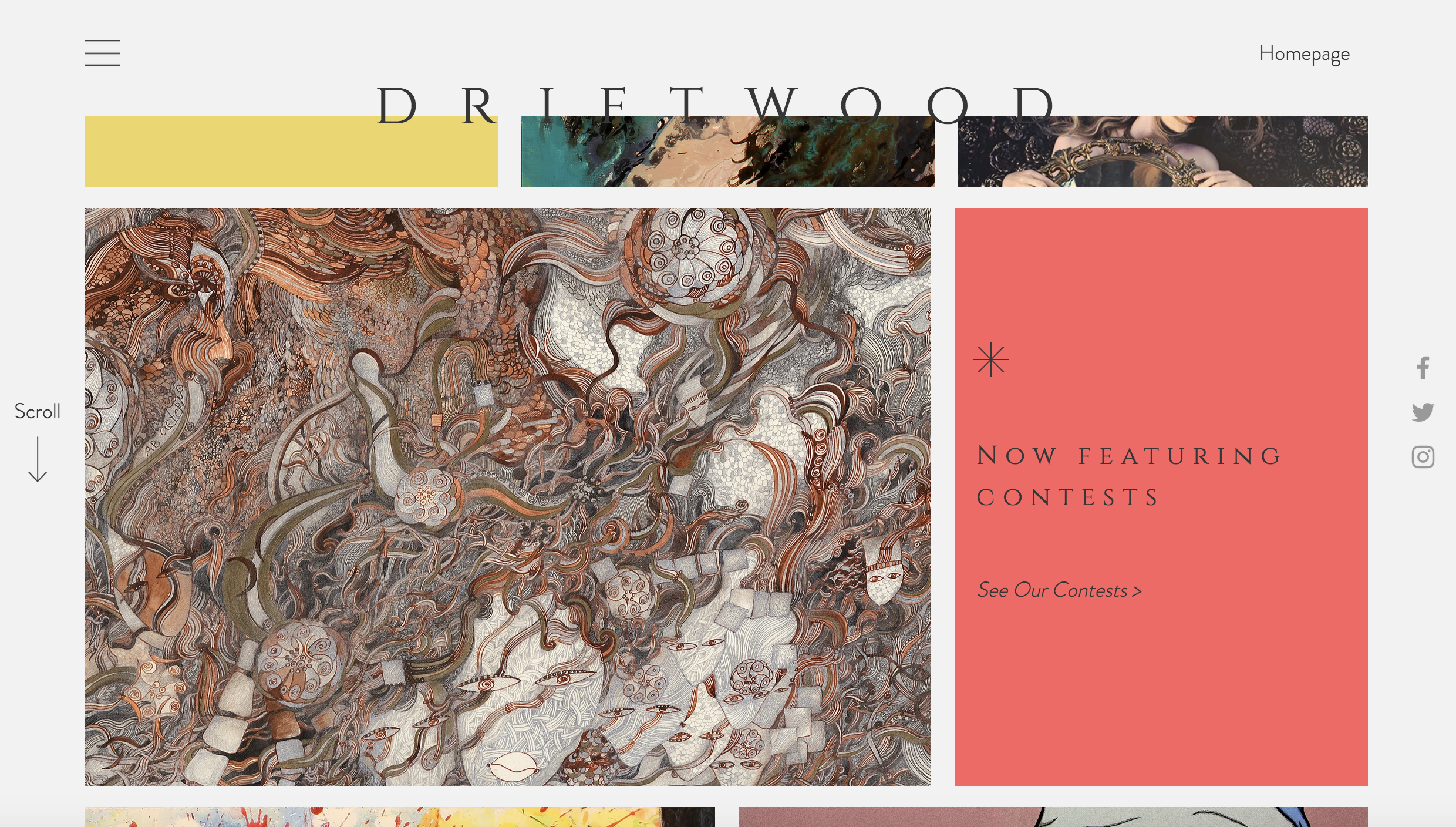
Once you establish a way to feature the most relevant information about your organization, design a navigational layout that makes the most sense for your potential website visitors. Consider who your website visitors will be, what information they will want to find, and what information is most important for you to display. Include the most relevant pages (like a link to submit to your open call) in the main navigation. Driftwood Press links to their primary pages (i.e. About, Issues, Contests, Contact) but also provides links to a few more unique pages that they want to emphasize.
Include an Announcement for the Open Call
In order to draw attention to your current open call, it’s important to feature the opportunity on your homepage in addition to creating a unique page with its own URL. Instead of relying on your users to find the correct information, this approach immediately alerts site visitors to your opportunity and helps guide them towards the full description. In the example below, Driftwood Press uses a callout for their open contests on the home page and provides a call to action that directs users to the unique URL for the contest page.
Clearly Display Consistent Guidelines on Your Form and Website
Correctly describing your opportunity is a crucial step in receiving the right submissions and applications. Avoid guidelines that are too long or detailed — you want to give submitters only the necessary information they need to submit. If users are overwhelmed or confused by your guidelines, they may leave the site before even getting to your form. Use this section to list submission criteria, give a deadline, and clarify eligibility.
Once you finish crafting a strong set of guidelines for your website, make sure that the information on your form is consistent and includes the same content. If your guidelines display conflicting information (such as a different date), potential submitters might abandon the form in confusion, miss a deadline, or fail to include the proper files. Save yourself and your submitters from a headache by keeping your messaging consistent across all platforms.
Ensure Your Submission Form is Linked on Your Web Page
Guidelines and announcements for your open call will be useless if potential submitters can’t find the next course of action. As you set up pages and callouts for your opportunity, remember to provide a call to action that guides users to the next step, such as a link to your form or email. If your organization uses Submittable, you can also embed a “submit” button on your website that links directly to your form. To use this button, go to ‘Forms’ and copy and paste the code at the bottom of the page (example below).

Be Consistent with Branding
Part of what makes or breaks a user’s experience on your website will depend on its visual appeal. Select a color scheme that reflects the colors in your logo or any other existing materials you might use. Next, find a font or a collection of fonts that you can utilize throughout the whole website. The fonts should be easy to read but also visually attractive and consistent with your brand. Strong branding ensures that your web pages are consistent and builds trust with users. If your branding is strong, potential applicants will feel more enticed to apply for your opportunity and spend time on your website.
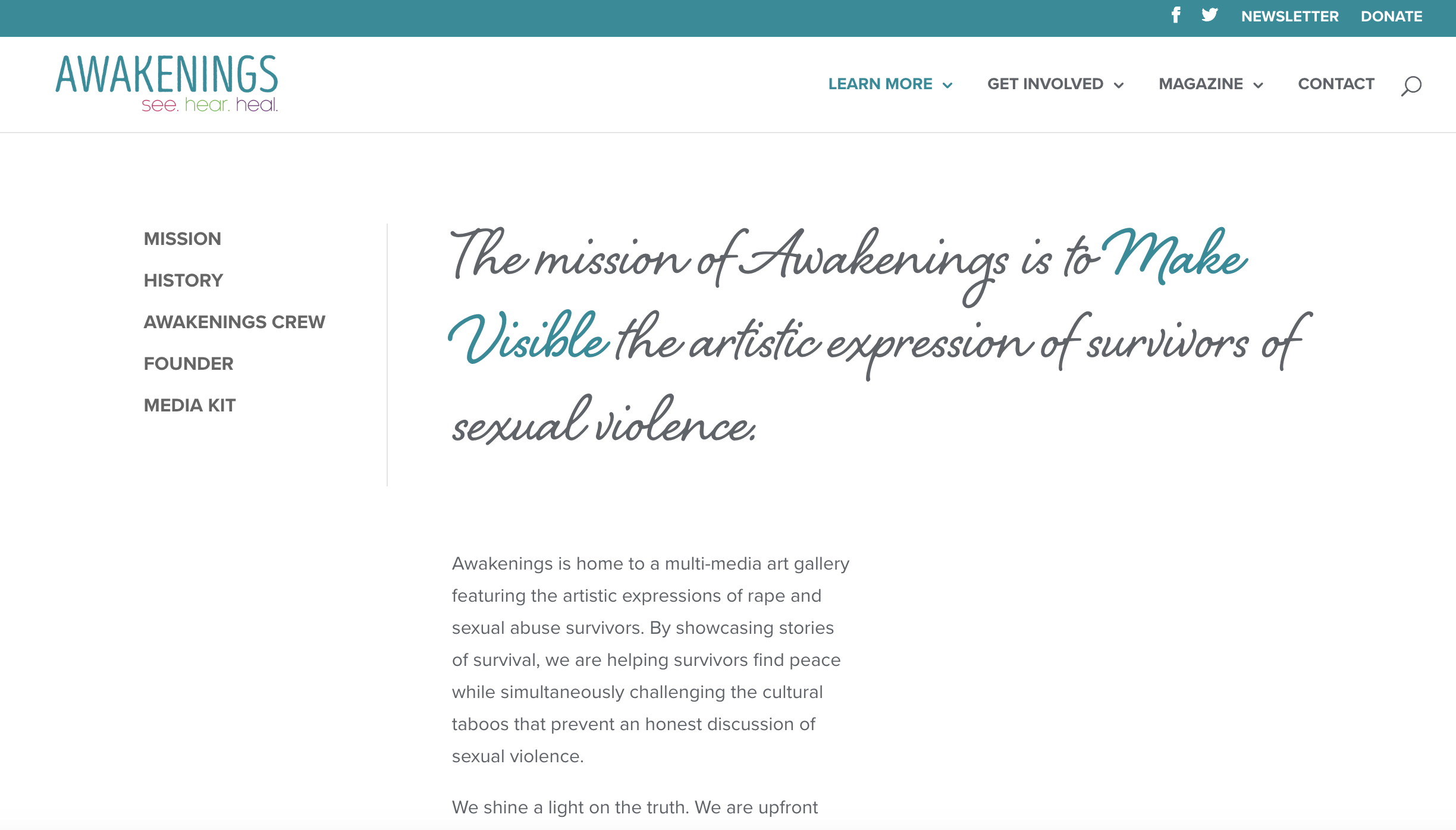
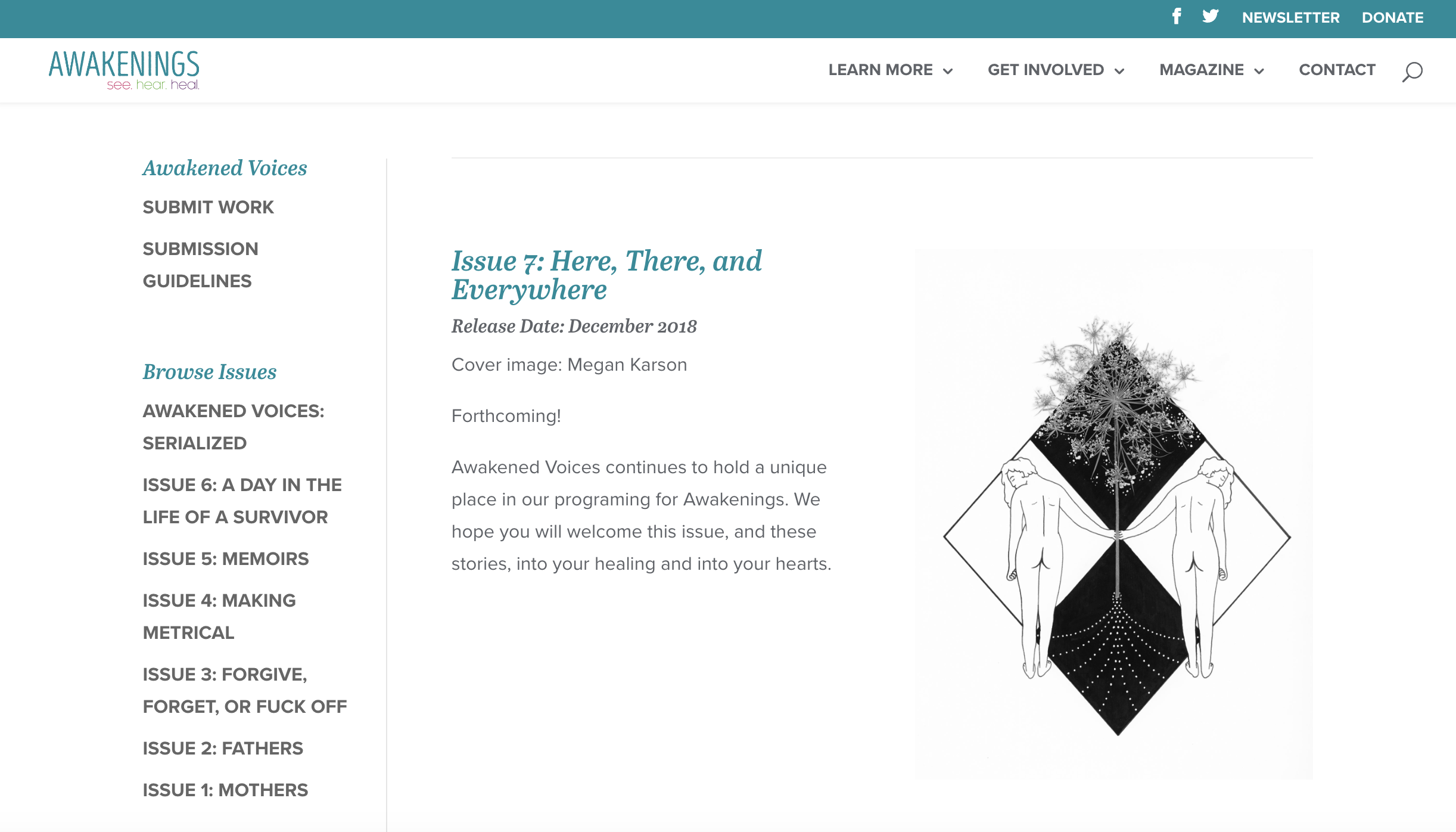
In this example, the Awakenings Foundation keeps a header with navigation and a logo throughout each web page. They also use one color scheme and alternate two consistent fonts.
Provide Relevant Examples of the Content You’re Looking For
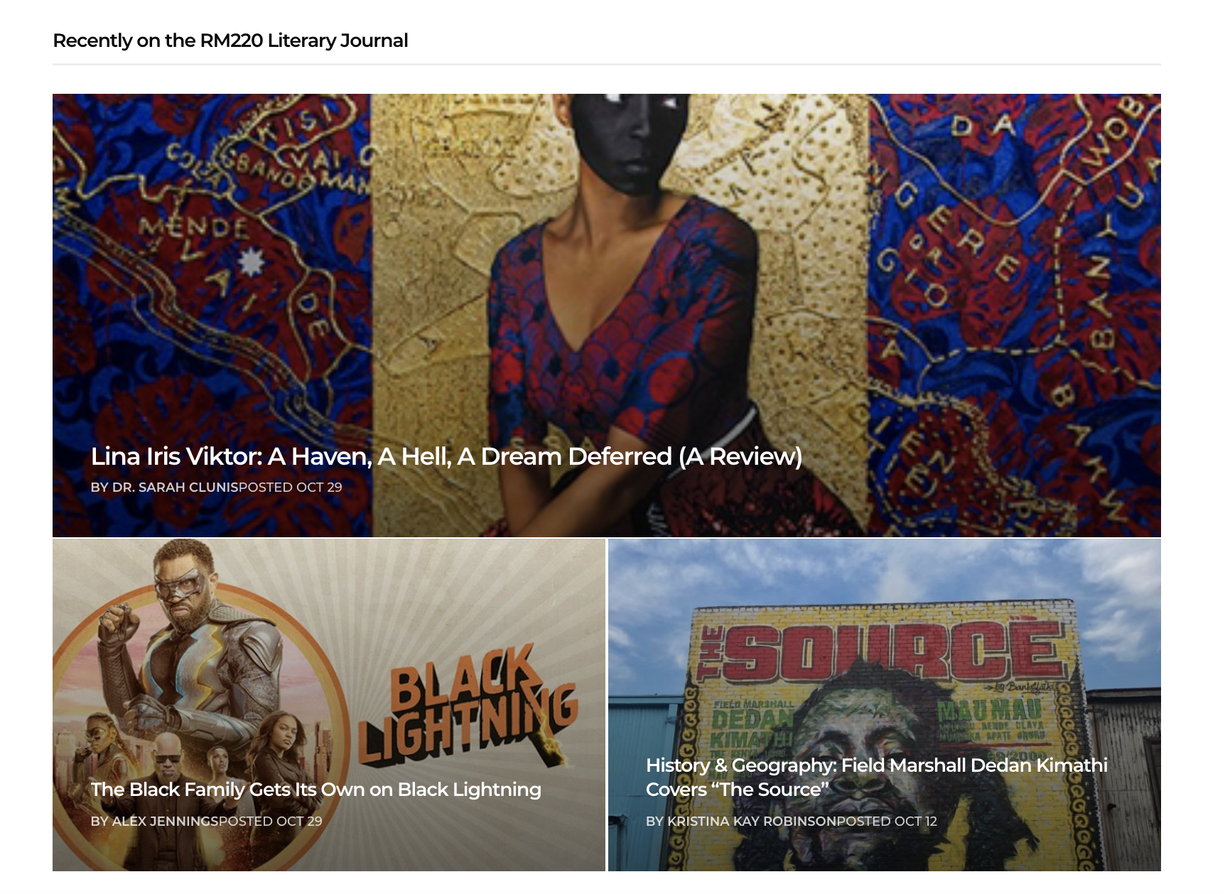
Before submitting, savvy users like to familiarize themselves with the organization hosting the opportunity. Providing a feature section on the homepage for the most recent work you’ve put out (i.e. past issues, gallery displays, previous winners) anticipates what your users might need. It also saves them from the possible confusion of searching for older content themselves that perhaps no longer accurately reflects your aesthetic. For organizations that specifically request submitters get to know their work before submitting, this is an especially important step. Finally, if your content is order or subscription only, you may want to consider providing previews or examples in order to allow potential submitters a glimpse into what you do and avoid a drop-off.
In this example from Antenna, the most recent publications from their literary journal are displayed on the homepage with links to the full content.
Include Social Media Buttons and Contact Information
Finally, before your site goes live, make sure you provide sufficient information on how to contact your organization and where else users can find you online. If your organization is on Facebook, Twitter, Instagram, etc., make sure to include social media buttons that link to your respective social channels. Tahoma Literary Review includes social media buttons in the footer below their newsletter subscription box, but you can experiment with the location that works best for your site.
If you’re interested in promoting your submission call on social media, check out these recent blog posts:


